The Skin of a Living Thought
In the 1918 Supreme Court decision Towne v. Eisner, Justice Oliver Wendell Holmes wrote the following:
“A word is not a crystal, transparent and unchanged; it is the skin of a living thought and may vary greatly in color and content according to the circumstances and time in which it is used.”
The word in question at the time was “income”, and the discussion was over whether or not the plaintiff had paid the appropriate taxes. The plaintiff argued that he had paid more tax than was necessary and that his actual income was less than what the IRS claimed. The question could not be answered without first agreeing on what the word “income” meant, so Holmes wrote these eloquent lines about the nature of language.*
By describing a word as the skin of a living thought, Holmes gave a physical human attribute to language. In doing so, he acknowledged the degree to which language is an embodiment of ideas. Like all things with bodies, language changes over time and in different contexts. Most of us are familiar with this, and we effortlessly pick up on the subtle differences in the meaning connoted by a single word when it is used in different situations.
Holmes also wrote about the changing color of words, and so he brought the topic of visual perception into the equation. Interestingly, our perception of color itself is also dependent on context. Josef Albers famously wrote about this in his book The Interaction of Color, and he showed how one color looks radically different depending upon its surroundings. In the image below the double x shape is the same color all the way through, but it appears to shift in tone because of the other colors around it.
In my experience this same thing is true of entire pieces of visual artwork. The context in which we see a piece of art changes our perception of that piece even though it does not change what the artist meant to communicate. For example, the first time I learned about the artist Henry Moore I was in college and looking at a picture in an old book – a black and white picture if I remember correctly. I don’t have the book anymore, but I remember my impression of it. I thought the sculpture was mysterious and modern, but I couldn’t get my head around it (literally or figuratively since it was printed on flat paper).
A couple years later I was living in New York City, and I kept seeing images of Moore’s sculptures printed on the city buses. It was 2008, and the busses were advertising an exhibition at the New York Botanical Garden called “Moore in America”. Twenty of his gigantic sculptures had been shipped over from England and artfully positioned throughout the garden. It was an appropriate way for them to be shown, since Moore himself believed the work was at its best out in nature. He said:
“Sculpture is an art of the open air… And for me its best setting and complement is nature. I would rather have a piece of my sculpture put in a landscape, almost any landscape, than in, or on, the most beautiful building I know.”
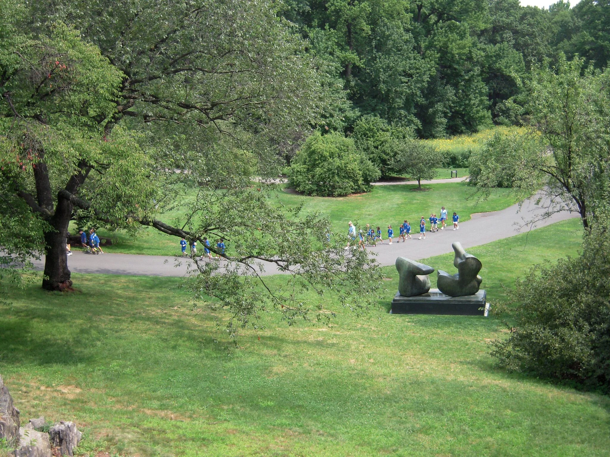
For several weeks I was too busy to actually visit the garden, so I only saw images of the work in little flashes as they flew by me on the ever-moving busses in the bustling city. When I finally did take the train all the way up to the garden in the Bronx, I was struck by the stillness and quiet I felt once I arrived. I was among a small number of weekday visitors to the garden (with the exception of some school groups), so I was almost alone with these Brobdingnagian bronzes. I could walk all the way around them and peer into and through their many carefully hewn holes and internal forms. The sculptures seemed comfortable lounging in the capacious garden as if they had been made for the place rather than temporarily loaned to it.
Henry Moore, Two-Piece Reclining Figure: Point 1969, Bronze
Henry Moore, Reclining Figure: Angles, 1979, Bronze
Henry Moore, Oval With Points, 1968-70, Bronze
My view of Moore as a sculptor was richer than it had been before this trip, because rather than reading about him or seeing images of his work, I had experienced the sculptures themselves in a contemplative setting.
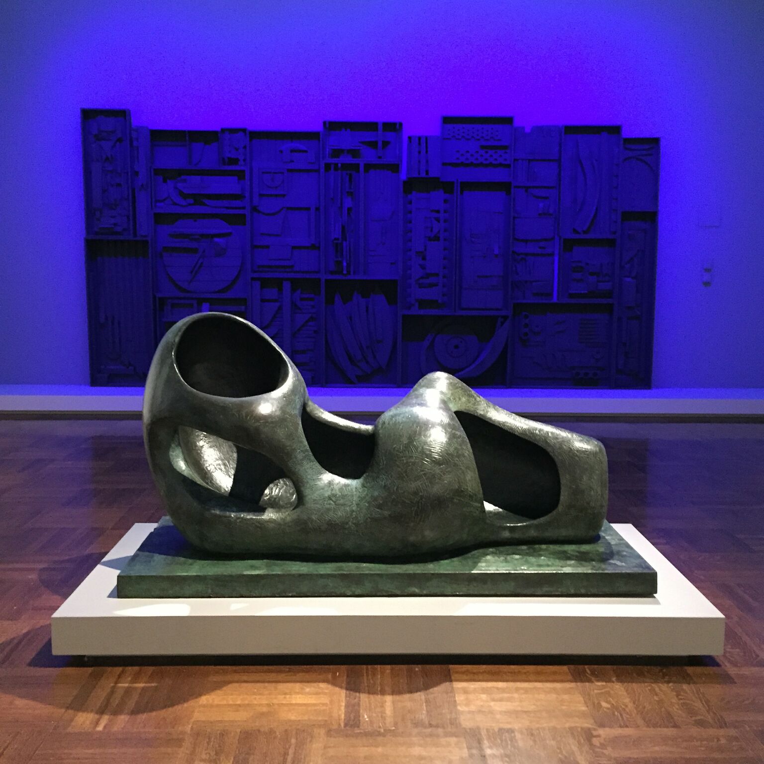
Since that time, I have seen Moore’s work in many places, but one other instance stands out. About six weeks ago I was at the Toledo Museum of Art with students. As we were about to leave I hurriedly walked through the modern section of the museum and saw a Henry Moore sculpture in the middle of one of the galleries. It was smaller than those I had seen at the New York Botanical Garden, and the room was partially filled with bold, purple light. The purple light was directed at another piece, but because the space was small the Henry Moore sculpture was bathed in artificially bright color as well - hardly the natural, outdoor setting Moore would have chosen. The sculpture had a strong enough presence in the space, but it seemed a bit smothered, and I could imagine that if it were a sentient being, it would be craving the “open air” Moore thought it deserved. Between the atmosphere in the room and my own feeling of hurry, I simply could not appreciate his work as I once had.
Henry Moore, Reclining Figure (External Form), Bronze, 1953-54
Later, after leaving the museum, I read a bit more about that particular sculpture and discovered that before the Toledo Museum of Art purchased it, Moore kept it outdoors in the garden of his house and studio in Hertforshire, England. I suspect its original home was a more natural environment for it.
Moore’s sculptures are often reminiscent of figures even when they do not explicitly represent them. In that way his sculptures are also like the skin (and flesh) of living thoughts. Since his work is often shown in public spaces, the question of context is a natural one, but it is also one that Moore can no longer control. Since his death in 1986 he has left us with a body of work (a body of work!) that we can ship across oceans, photograph, and print on the sides of busses. We can write about it, draw cartoons about it, and inevitably at some point we will accidentally damage some of it. Because they are large and made out of materials like bronze and stone, his pieces are unlikely to be completely destroyed, but they will almost certainly develop new meanings to new generations. And yet, like words taken from one language into another, they will likely retain some vestiges of their original meaning even as their primary definitions shift.
In one sense this is humbling both to artists (whose work will likely be misunderstood some day) and viewers (who are almost certainly misunderstanding what artists of the past meant to convey). But one could also interpret it as a reason to keep making and keep looking. There are words in the English language that no longer mean what they once did but nevertheless serve an important purpose for speakers today. The word “president”, for example, once meant little more than “foreman”. Its meaning has grown as the role it represents has also grown. In the same way, we do not always know what role a given piece of art will play in the lives of future generations, but it is not impossible that the role will be even greater than the one the artwork has today.
* I was alerted to this quote when I listened to the wonderful podcast Way With Words this past week. Check out their website if you like that sort of thing.
The Success of Others
Writer Gore Vidal is known for saying, “Whenever a friend succeeds, a little something in me dies.” Most writers and artists recognize this sentiment with a familiar cringe. Even if we are genuinely happy when one of our friends shows his work in a prestigious gallery, there’s still a small part of us that would be even happier if the success had been ours.
It’s a mercy, then, that most of us befriend people who are not, at least in the literal sense of the word, geniuses. When our associates outdo us, they do so by a margin that does not overwhelm us.
And yet, there are exceptions. Rare as they may be, geniuses do exist, and their friends, colleagues and families must learn to flourish even as these extraordinary people hurtle on ahead of them toward successes unfathomable to more ordinary minds.
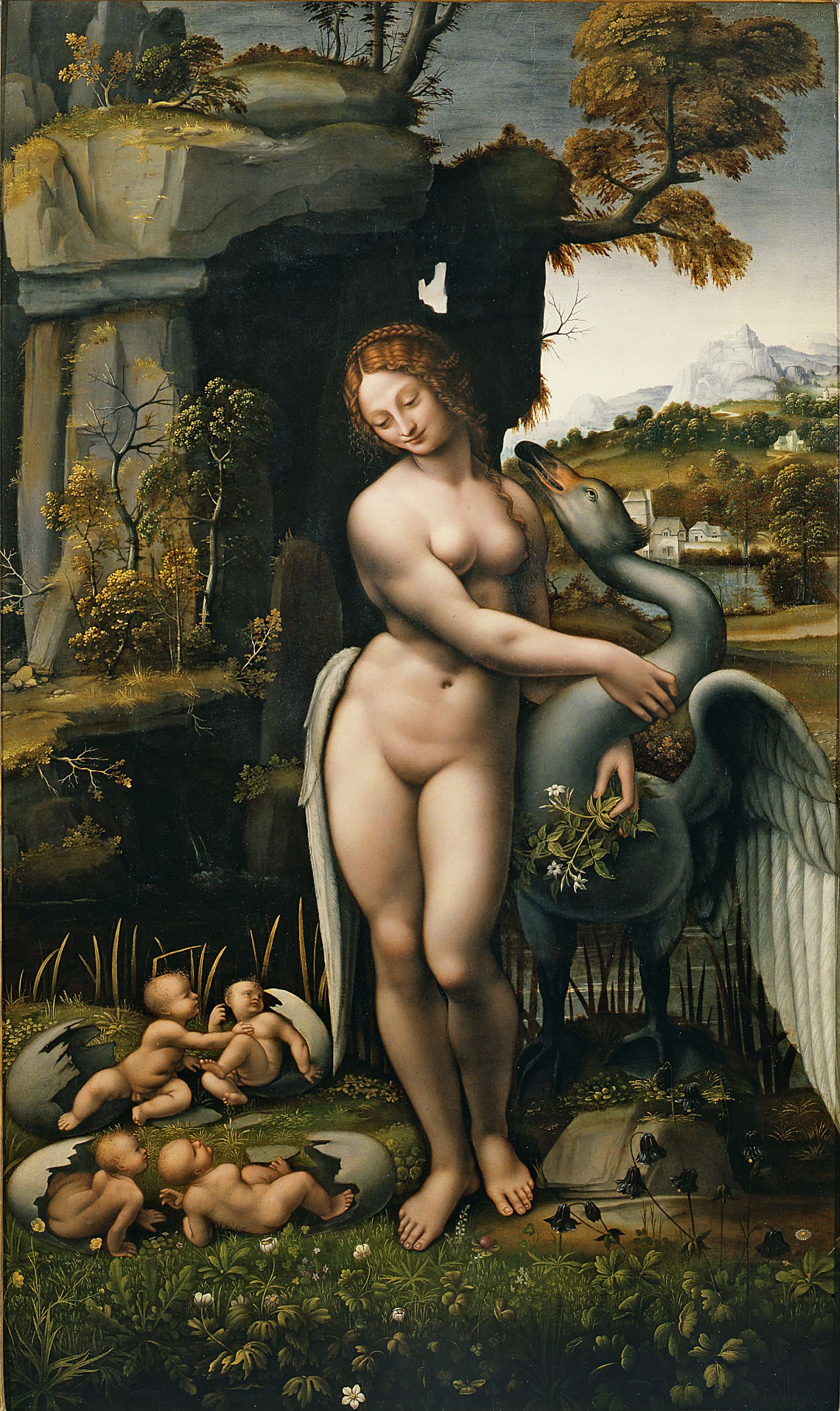
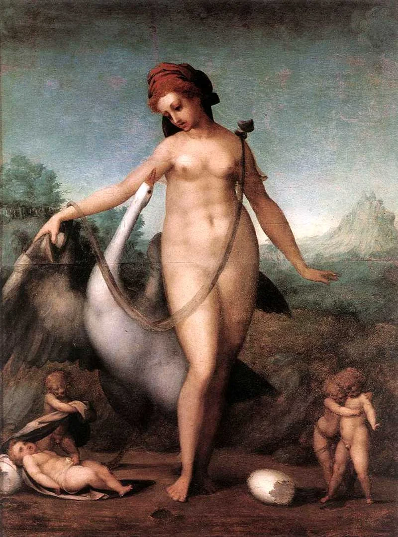
One artist who faced this challenge was the Mannerist Jacopo Pontormo. Apprenticed to Leonardo da Vinci at a young age and friends with Michelangelo Buonarroti, Pontormo consorted with some of the greatest men of the Italian Renaissance. As a young artist he was influenced by Leonardo da Vinci’s work, and there are strong similarities between the two artists’ versions of Leda and the Swan. Though Leonardo's painting has been lost, there are copies of it which can be compared to Pontormo's piece.
Unknown Copyist of Leonardo da Vinci, Spiridon Leda, Oil on wood, ca. 1505-1507
Jacopo Pontormo, Leda and the Swan, Tempera on wood, 1512-1513
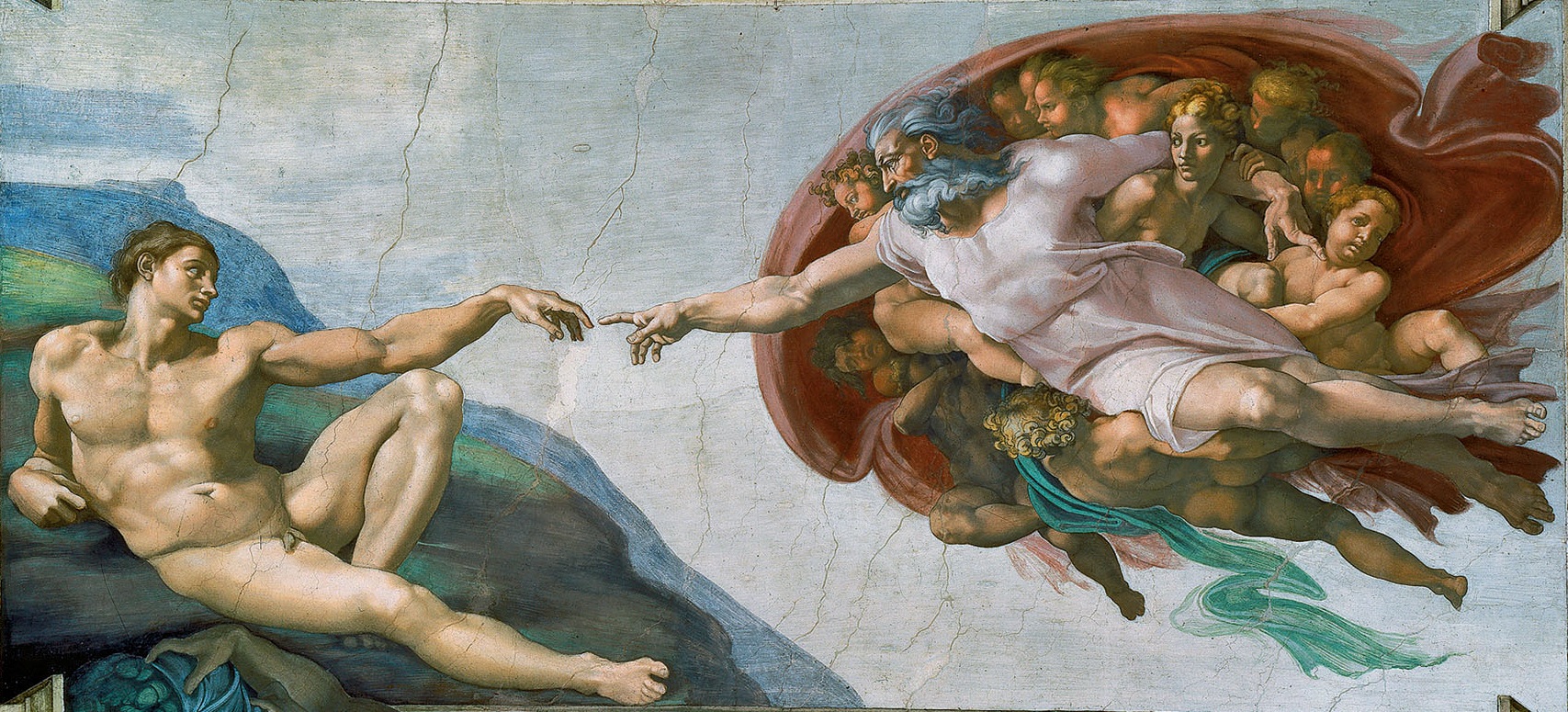
One of the things that is often said about the Mannerist movement in general is that these artists had a very tough act to follow. Mannerism emerged in the early 16th century just as the High Renaissance was reaching its peak. During the Italian Renaissance, artists rediscovered the glories of Classical art and brought this newly uncovered ancient knowledge to their work. Looking across the artwork from the Early Renaissance to the High Renaissance, one senses a crescendo. Artists were rapidly becoming better at using linear perspective, at understanding human anatomy, and at modeling the forms of the body with chiaroscuro (light and darkness). All of these were attempts to make things appear as they do in real life, to make drawings and paintings of people who seem to be living in three-dimensional spaces with actual muscles and bones underlying their skin. At the climax of all this progress are the masterpieces of the High Renaissance such as the Sistine Chapel.
Michelangelo Buonarroti, The Creation of Adam (from the Sistine Chapel ceiling), Fresco, 1512
But after a crescendo builds to its peak, then what? For Jacopo Pontormo this question was not an abstract one. At forty-two years younger than da Vinci and seventeen years younger than Michelangelo, he was both too close to their age to avoid comparison and too much younger to simply do what they had done. Standing inside the long shadow of their genius, he had to find a way to step forward and cast his own shadow, even if it was a smaller one.
Pontormo could scarcely make his figures more realistic than those of the High Renaissance, nor could he create a more convincing illusion of space than the masterful draftsman before him had already done with their careful use of linear perspective. Instead of trying to improve on their work, he turned to something new. He stopped trying to make everything look as it does in real life and began experimenting with artifice. He and the other Mannerists are called by this name because they worked in a sort of mannered, stylized way. Rather than make space look believable, they made it ambiguous and strange. Rather than make their figures look real, they made them distorted and expressive. Vividly colored, lyrical, exaggerated, and emotive, these pieces contrast strongly with the calm, rational, and realistic images of the Renaissance.
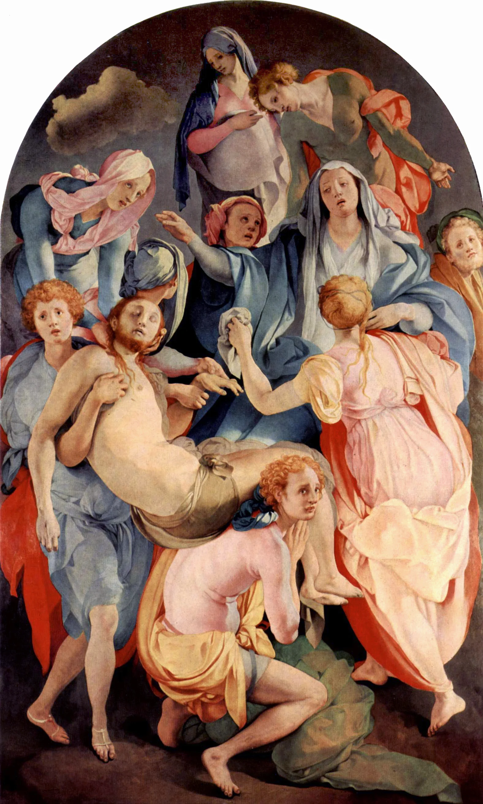
One example of this style is Pontormo’s Descent from the Cross. The figures in this piece are contorted in ways that are completely unnatural, and the sense of space is also difficult to decipher. Are those figures in the back standing on pedestals to make them so high up in the picture plane? Would the two figures in the foreground really be able to support the weight of the dead Christ while standing airily on their tiptoes? And the color – why are so many people wearing brilliant pinks and oranges in what is ostensibly a very sad scene?
Jacopo Pontormo, The Deposition from the Cross, Oil on wood, ca. 1525-1528
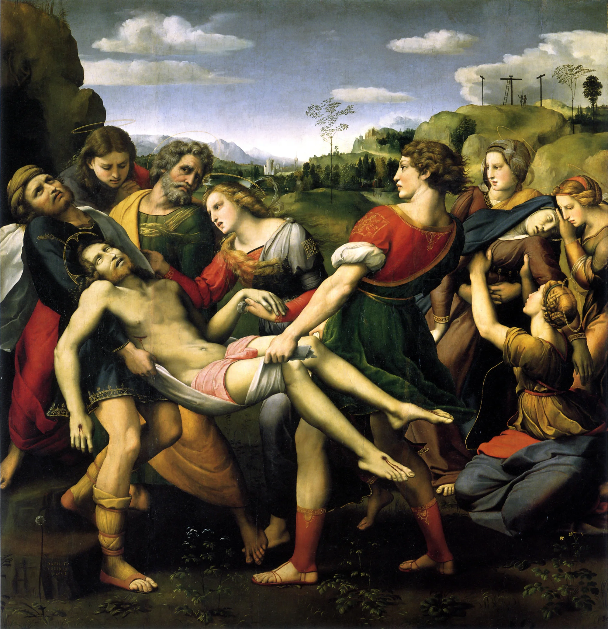
For the sake of comparison, it is worth looking at another depiction of the same scene by Pontormo’s slightly older (11 years) contemporary, Raphael. In this painting both the forms of the bodies, and the sense of space are more true to life.
Raphael, The Deposition, Oil on wood, 1507
Pontormo’s composition was also unusual for the time. During the High Renaissance artists often put the main figures in the center of the image, but at the center of his image there is an empty void around which the rest of the image seems to revolve in a flurry of confusion. At the time it probably seemed like a strange way to paint the scene, but this composition is not unlike the actual experience of grief, since a feeling of emptiness and absence pervades that as well. Even the overly bright colors create an emotional dissonance which is not unlike the feeling we experience when we see and smell the floral arrangements in a funeral home; everything is so pretty even though we are so sad.
Pontormo was a complicated person for other reasons besides his innovative style and his proximity to genius. He also had personal habits that many people would consider odd. During the later years of his life he kept meticulous records of his food intake, his deteriorating health, and (most regrettably) his bowel movements. During these later years he also became melancholic and reclusive. He had a ladder leading up to his quarters, and he would sometimes pull it up into the building so that others could not visit him for weeks on end. In his Lives of the Artists, art historian Giorgio Vasari described his living situation this way:
“Indeed, although some persons declare that he had it in mind to spend largely, according to his position, and to make a commodious dwelling and one that might have some design, it is nevertheless evident that what he did, whether this came from his not having the means to spend or from some other reason, has rather the appearance of a building erected by an eccentric and solitary creature than of a well-ordered habitation, for the reason that to the room where he used to sleep and at times to work, he had to climb by a wooden ladder, which, after he had gone in, he would draw up with a pulley, to the end that no one might go up to him without his wish or knowledge.”
Given these aspects of his personality, Pontormo seems a likely candidate for breaking from artistic norms, since he was already something of a misfit. But it is also true that his circumstances pushed him to be experimental. In the wake of the genius of others, he could not improve on what had already been done and was thus forced to do something completely original. In that sense, his awkward position in the timeline of Art History may have been serendipitous, and his oddities not the cause of his innovation but merely a coincidence.
If Gore Vidal is right, the success of others can feel like a death. But Pontormo’s bizarrely effective paintings indicate that the success of others can also be a launching pad into a new and different future, one in which we stop trying to outdo our peers and start finding our own way of doing things. Pontormo’s lifestyle may not be one to which many of us would aspire, but his artwork with all its eccentricities is hopefully something in which we can see bravery – the bravery to continue working even without the hope of being the very best.
Seeing the Invisible War
Flying over New York City this past Friday night, I saw the tiny Statue of Liberty down below, its bright lights flickering against the dark water around it. Next to me sat a young woman, and I pointed out the monument, so perfectly framed by our shared window, to her. This was the beginning of one of those happily awkward conversations that sometimes happen on planes. I discovered she was a senior in college visiting her husband who was stationed in New Jersey for spring break. They were going to spend the night in a hotel near the airport and then travel down to Disney World together. She talked about her eagerness to graduate and spend more time with him but also about her worries – would he be deployed? What would she do if he were?
We landed, and I sped off to the gate of my flight to Boston. I had missed the flight because of delays in New York, and in the flurry of getting booked onto another flight and arranging a later pickup from the Boston airport, I forgot about her.
Sunday afternoon I went to the Museum of Fine Arts in Boston and looked at one of their current exhibits: Over There! Posters from World War I. Brightly colored propagandistic images, images once used to convince Americans to enlist, give money, eat less bread, and even die for their country were prettily matted and framed in the galleries of the museum. There’s a dissonance to displays like this. The setting is so genteel – museum-goers, some of them still wearing their nice church clothes, strolling about in a space that cost them a twenty-five dollar ticket to enter. Squint your eyes and don’t read the text on the brilliantly colored posters, and nothing seems awry – just a group of wealthy people looking at beautiful things.
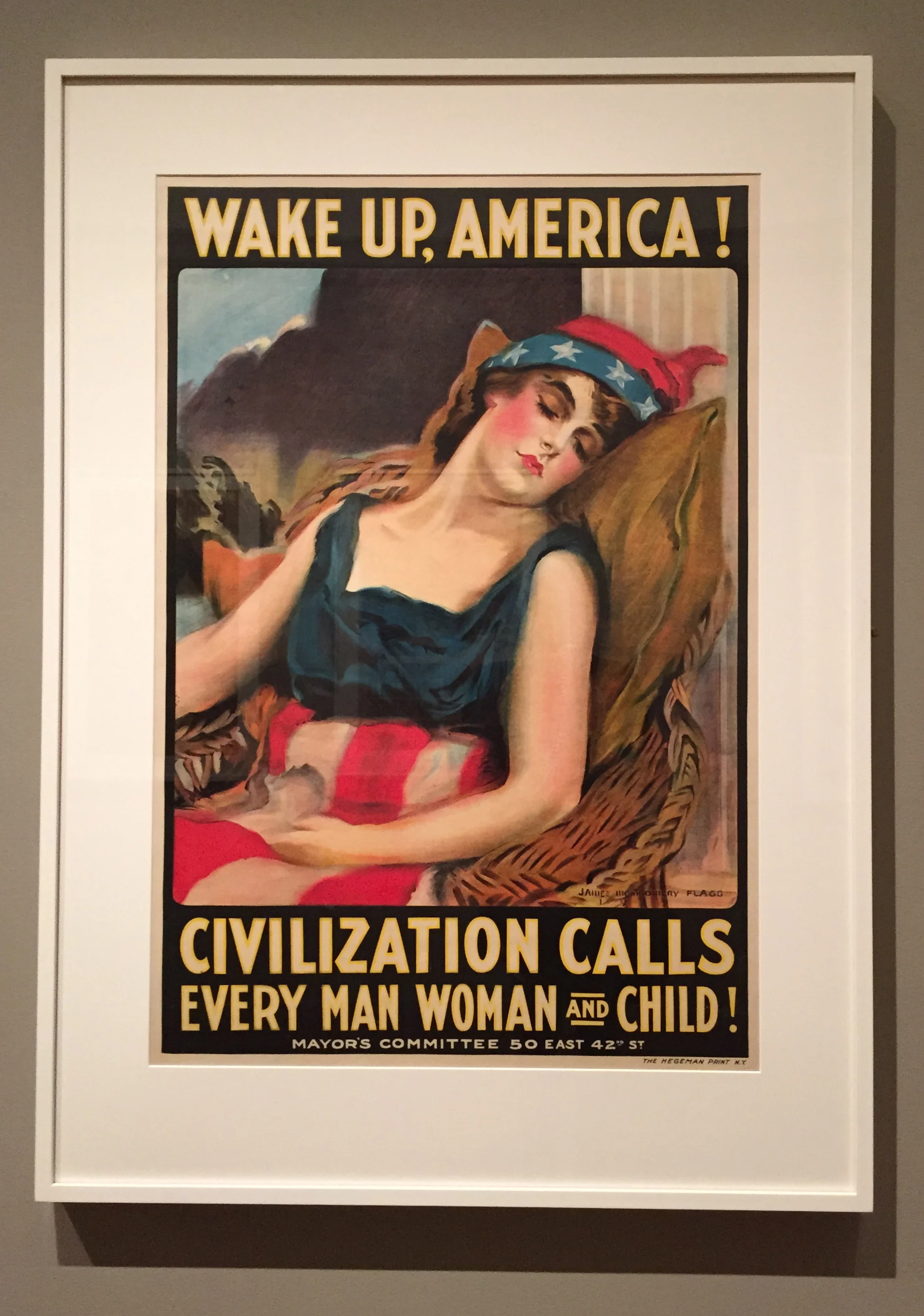
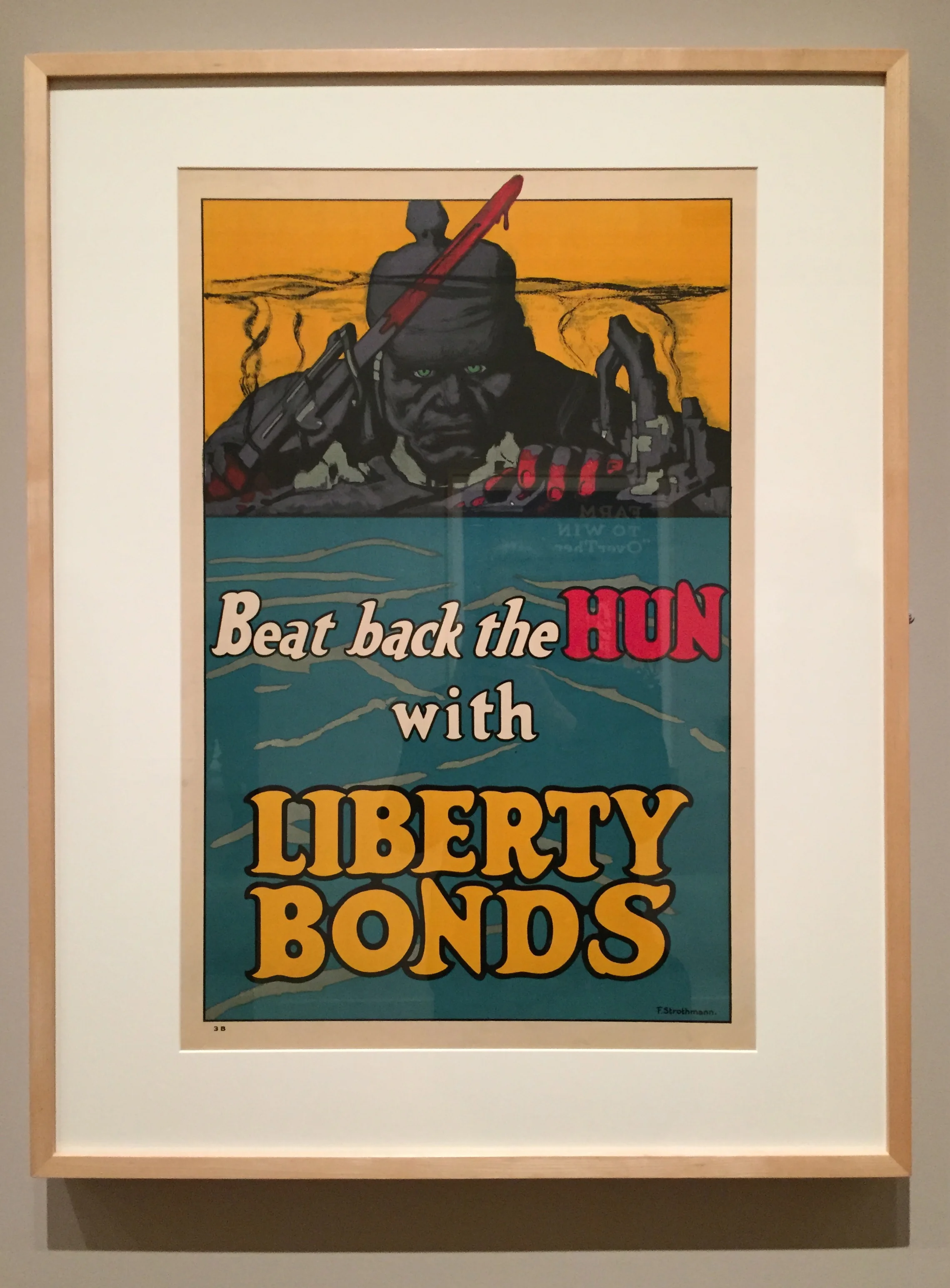
But it is hard to squint that much. The text is large and designed to be read. “WAKE UP AMERICA!” reads one. “FOR VICTORY, BUY MORE BONDS,” reads another. “Beat back the HUN with LIBERTY BONDS!” “JOIN THE AIR SERVICE AND SERVE IN FRANCE! DO IT NOW!” Cacophonies of demands reverberate across the walls of the gallery.
James Montgomery Flagg, Wake Up, America! - Civilization Calls Every Man, Woman, and Child!, Color Lithograph, 1917
Fred Strothmann, Beat Back the Hun with Liberty Bonds, Color Lithograph, 1918
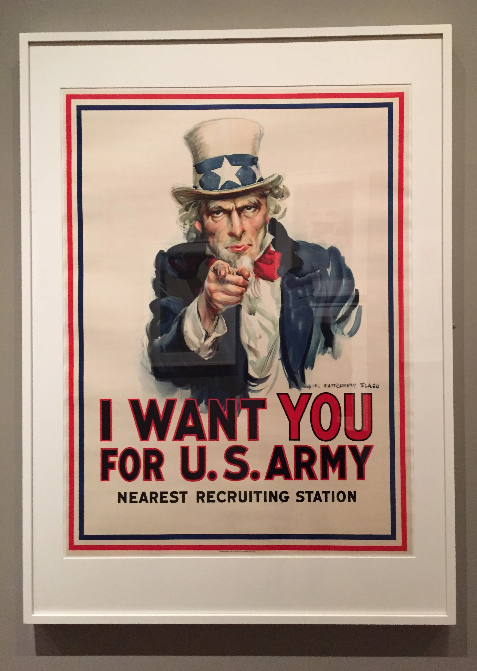
The posters were created as a part of a campaign from the Committee on Public Information. In 1917 Woodrow Wilson established this committee and gave them the assignment of inspiring the people to patriotism and sacrifice. Charles Dana Gibson, who was also the president of the New York Society of Illustrators, headed one division of this committee, the Division of Pictorial Publicity. The artists Gibson gathered together to make these posters were volunteers who donated their talents and created some of the most striking images of the era. Some of them, particularly James Montgomery Flagg’s I Want You for (the) U.S. Army, are now iconic.
James Montgomery Flagg, I Want You for U.S. Army, Color Lithograph, 1917
This is not the first time these posters have been displayed in the museum. John T. Spaulding gave this collection to the museum in the summer of 1937, and they were first displayed in October 1938. A visitor seeing that display would have known that another conflict was about to begin in Europe. He would have also remembered the sacrifices made by ordinary citizens during the First World War. He may have been wealthy enough not to suffer personally during the Great Depression, but the reality of it was all around him. In that context, these posters must have cast an ominous shadow over his thoughts about the future.
On the walls of the current exhibit small notes from the curator, Patrick Murphy, are printed for visitors to read. In one of them Murphy reflects on his experience of putting together this exhibition.
“While sifting through the Spaulding collection of WWI posters in preparation for this exhibit, I was struck by the notable differences in Americans’ experience of war then and now. In recent years, it has been possible for many of us to forget that we were at war in Iraq and Afghanistan. In 1917 and 1918, as these posters attest, the call for personal sacrifice – whether through the conservation of food, purchase of Liberty Loans, or support of the Red Cross – permeated every aspect of life on the home front.”
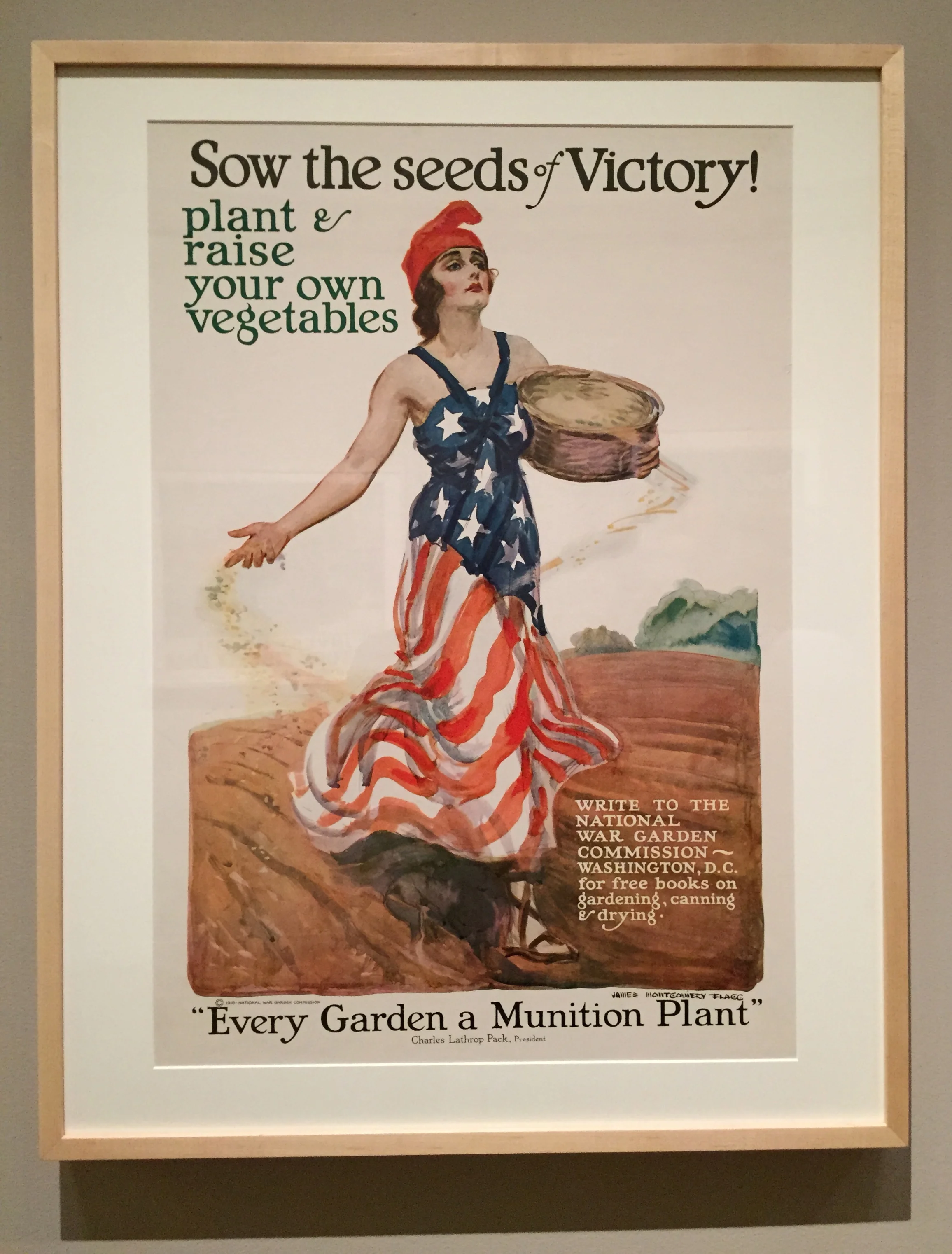
Murphy’s words took me back to my conversation on the plane from several days before, but it also reminded me of many other similar moments I’ve had in airports. As a Midwesterner who was in school on the East Coast from 2003-2009, I spent a lot of time in airports during those years. Those times were always the ones when I realized most acutely that we were at war. During the rest of the semester I was stressed out with all the homework I had to do, but when I got to the airport to travel home for Thanksgiving and Christmas I saw people my age who were more than stressed out; they were traumatized. Hollow-eyed men and women wearing fatigues sat next to me in the airport while I (and many other college kids in Boston Logan Airport) sipped my Starbucks gingerbread latte and read my book. The posters on the walls encouraged us not to plant and raise our own vegetables in a victory garden but to try the peppermint and eggnog flavored lattes too.
James Montgomery Flagg, Sow the Seeds of Victory! - Plant and Raise Your Own Vegetables, Color Lithograph, 1918
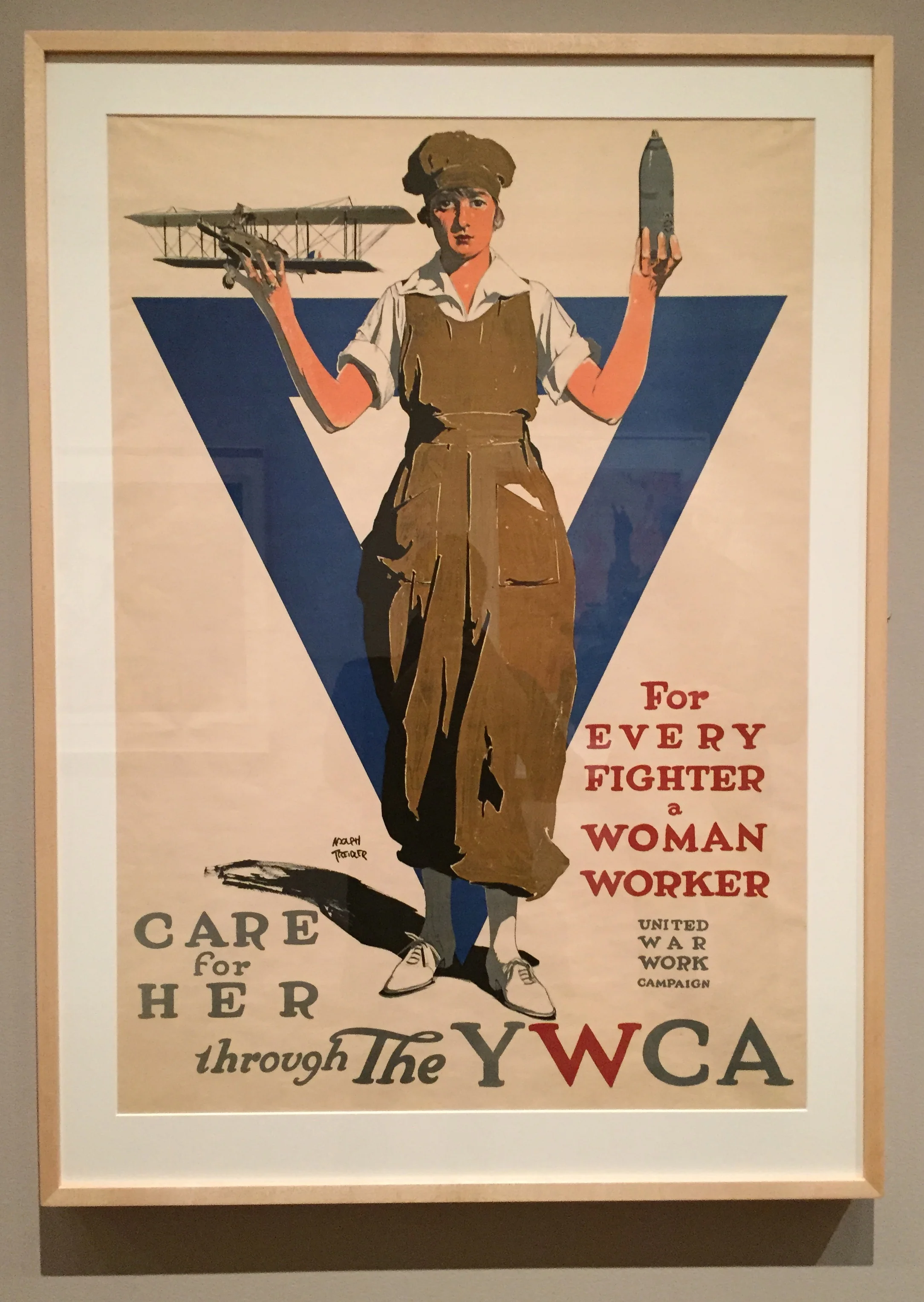
I’ll probably never know what we with our over-stuffed backpacks and college sweatshirts looked like to them. What I do know that is that war wasn’t always so tidily quarantined away from civilian life. As these posters make apparent, there was a time when young people were not so neatly divided into those who fought and those who stayed home. Any young man could be drafted, and young women were encouraged to do their part as well by working in a munitions plant or volunteering with various organizations.
Adolph Treidler, For Every Fighter a Woman Worker - United War Work Campaign - Care for Her through the YWCA, Color Lithograph, 1918
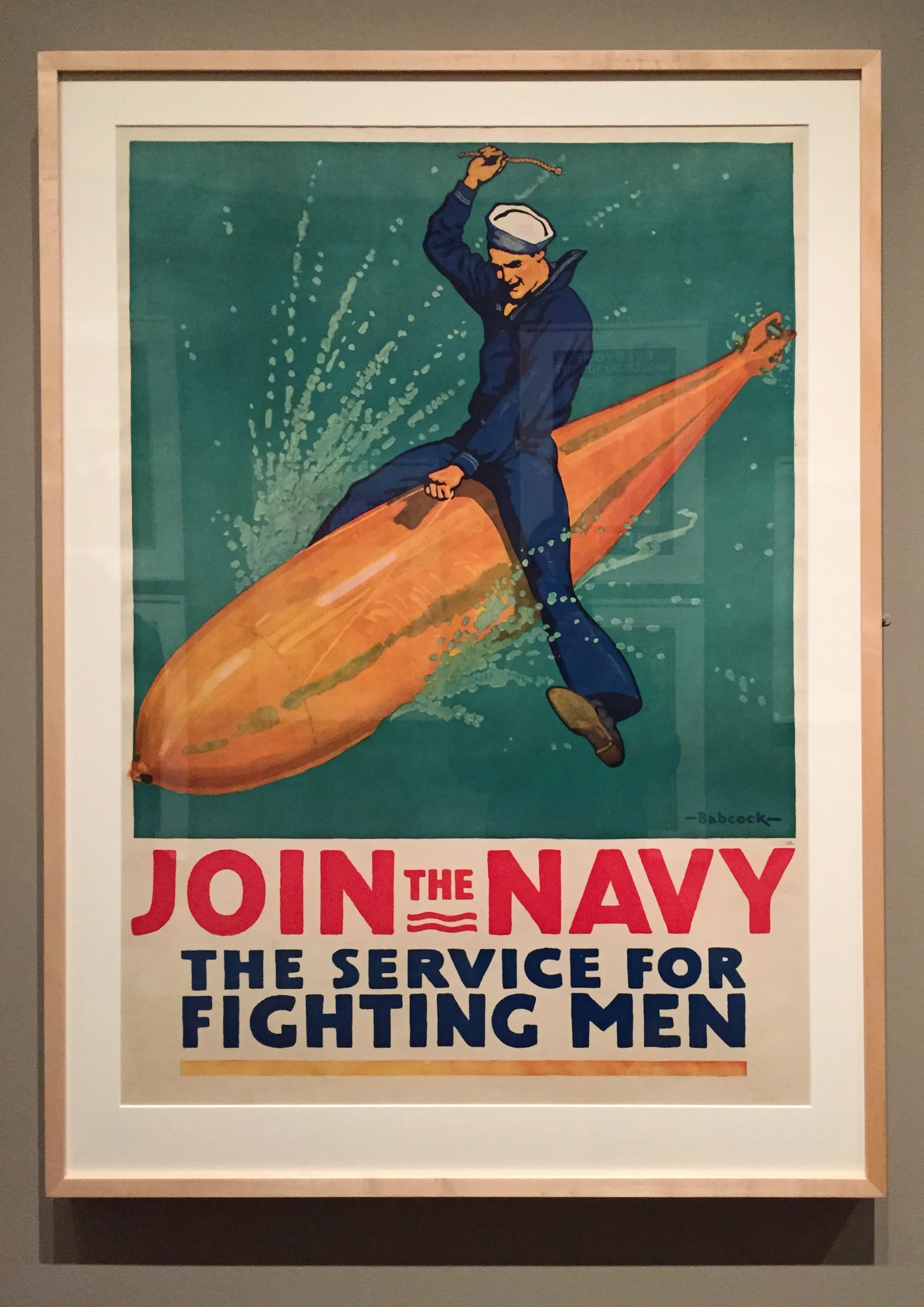
In saying this I don’t mean to be nostalgic about the posters or the world as it was in 1917. While the posters made people aware of the war they were fighting, they also hid its horrors. An image of a sailor riding a torpedo through the water makes war look like an exciting adventure, a roller coaster of good times and proof of one’s great manliness. Needless to say, the actual war was not like that. Nevertheless, what I like about these posters, and what I think they offer to contemporary viewers, is the reminder that the way some of us blithely go about our business during war is somewhat unique to our time.
Richard Fayerweather Babcock, Join the Navy - The Service for Fighting Men, Color Lithograph, 1917
The Empress's New Clothes
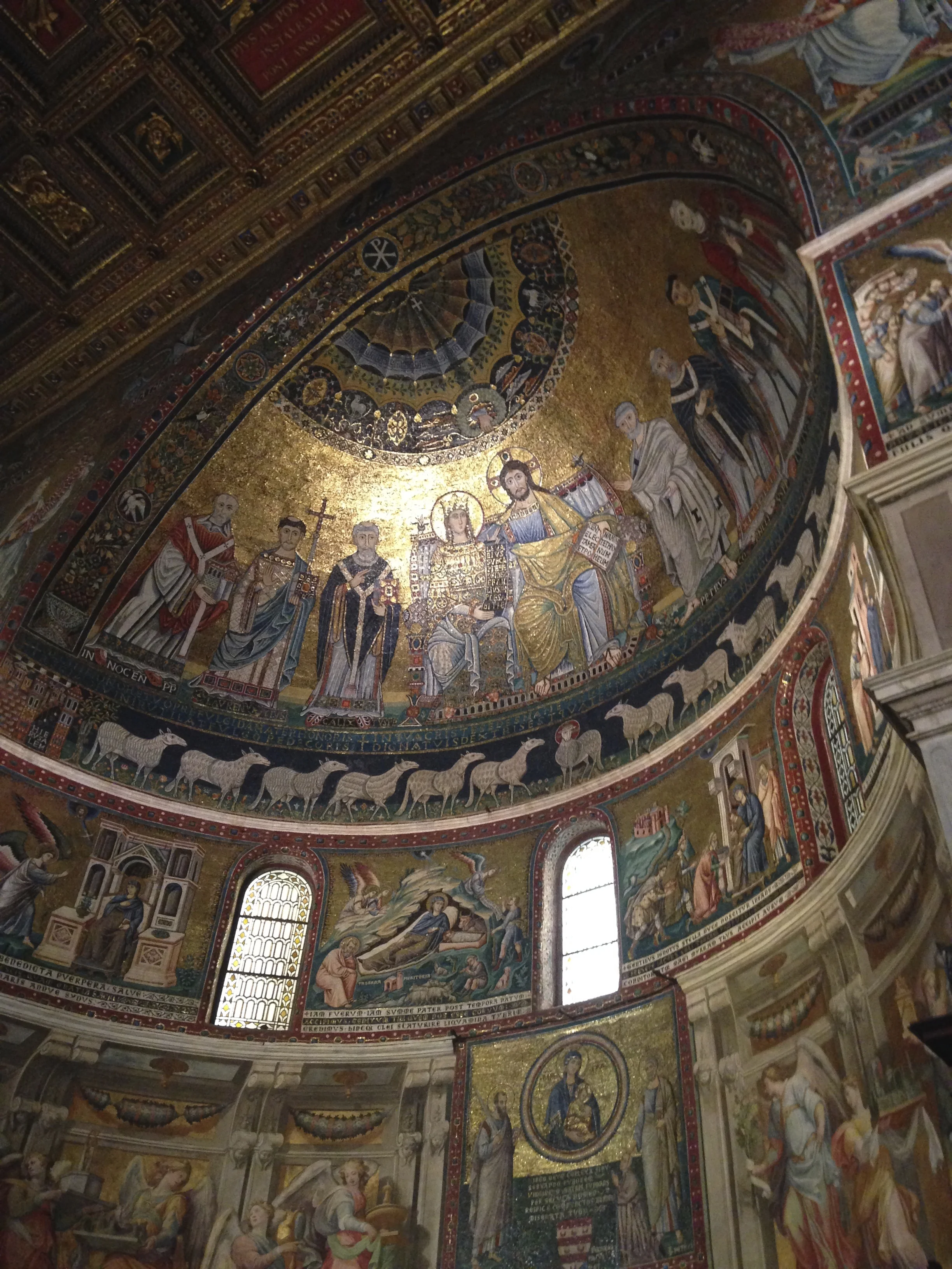
I’ve never been to Ravenna, Italy, but I’d like to go there and see the Byzantine mosaics. When I’ve seen other glittering, Byzantine-style mosaics, such as those in the Basilica di Santa Maria in Trastevere, a little shiver runs down my spine. There is something awe-inspiring about the uneven sparkle of those many miniscule multi-colored glass and gold pieces put together.
Basilica di Santa Maria in Trastevere
The city of Ravenna was on my mind recently because I was reading about one particular mosaic in the Basilica di San Vitale in Ravenna: The Empress Theodora with her Retinue. The book I was reading is called Masterpieces in Detail by Rose-Marie and Rainer Hagen; it shows full-page images of small details of famous works of art and explains the significance of those details. Unlike most art history books, which only show a small postcard-sized image of each work of art, this book allows the reader to look at the minute details of every piece – the strokes of paint, the crevices between the pieces of mosaic, and the stitches in the tapestry.
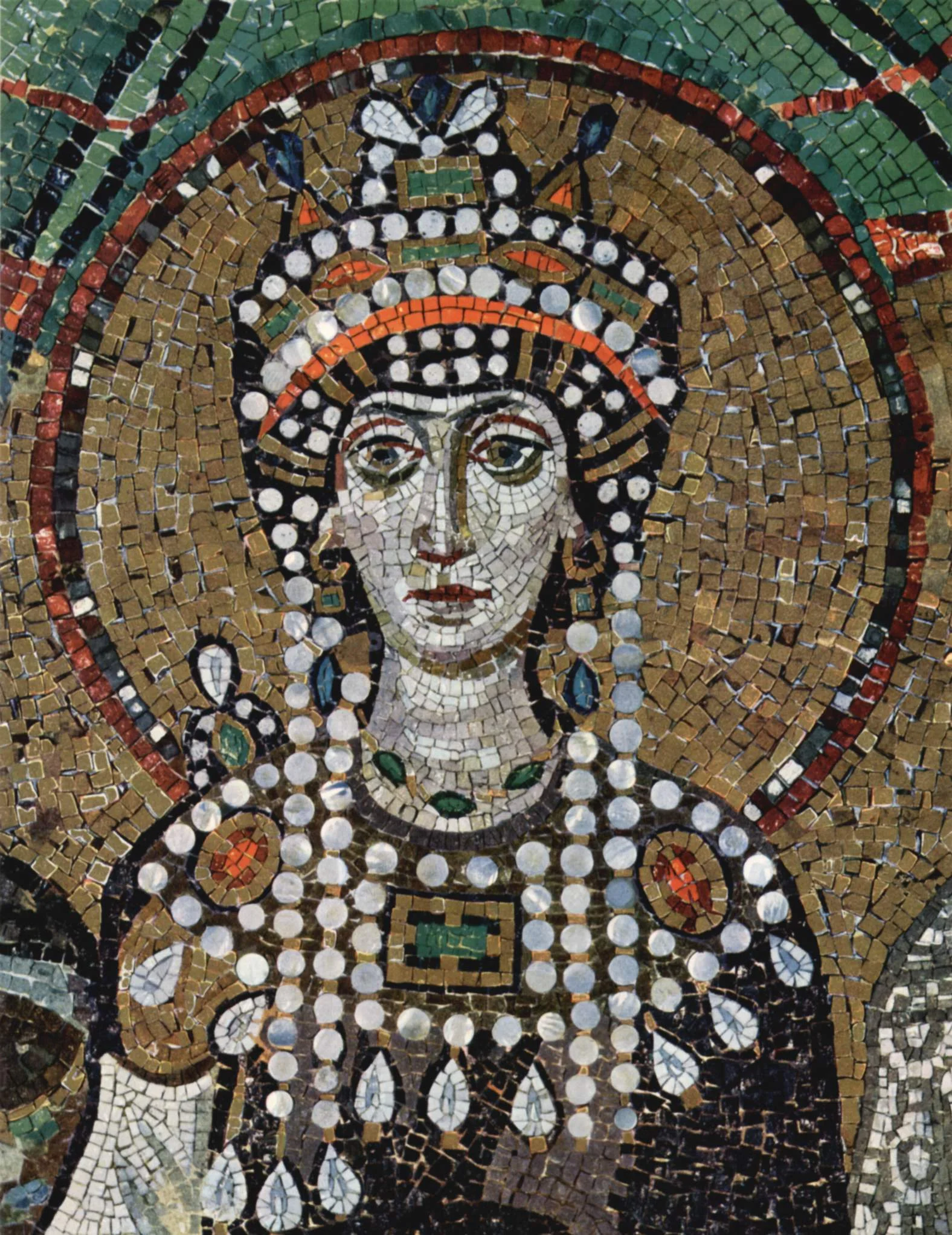
The Empress Theodora with her Retinue, mosaic, ca. 547
In this mosaic we see Theodora ensconced in the middle of her entourage, wearing her resplendent purple robes and leading a procession to carry the communion chalice to church. She is the only person over whom no other figure overlaps, and she wears a crown encrusted with large jewels. She is also the only person whose robes are purple. These purple robes are one of the significant details the book illuminates so well. The book explains that Tyrian purple, the shade made from snails in Tyre, was reserved for royalty. Wearing it without permission was punishable by death. Her robes were probably also made of silk, interesting since silk fabrics were a state monopoly, and she controlled others’ access to them. Even the ladies in her court received their silken clothing directly from her. The detail on the hem of her robe is significant too. It shows the three wise men carrying their gifts to Christ; having such a decoration on her robes elevated her status and suggested that she too belonged in the company of those wise men.
One of the Details inside Masterpieces in Detail by Rose-Marie and Rainer Hagen
Looking at her here, it would be difficult to guess Theodora’s background. Imperially slim, confident, with a golden nimbus around her head, she appears to be a cross between a saint and a queen – holy and regal in equal measures. As the book tells us, however, the reality of Theodora’s early life was not that of a princess. When the emperor Justinian met her she was a young girl from a lower class family. She worked doing a Leda-and-the-Swan-themed striptease number with a goose who picked grains of corn out from between her thighs while she made sounds of ecstatic delight. The bishop of Ephesus put it bluntly and said, “Theodora was from a brothel.”
The idiom “the emperor’s new clothes”, familiar to anyone who has read the Hans Christian Anderson story by the same name, refers to situations in which people believe (or pretend to believe) something in spite of clear evidence to the contrary. In the case of Theodora, however, the new clothing she wore as empress was no hoax, and her days of performing nearly naked for the pleasure of others were truly over. The book makes it clear that Theodora’s personal evolution was as genuine as the Tyrian purple silks she wore, and her fitness for the office of empress was apparent once she began to rule. When her husband Justinian fell ill with the plague, Theodora took on the majority of his responsibilities. Though it was unusual for women at the time to hold power, during the period of his illness she was the highest authority in the empire, and she proved herself competent and wise. She also remembered her difficult past, and, in an edict that must have felt personally significant, she outlawed prostitution.
Backing up from the details of Theodora’s personal story and looking at the entire mosaic, with all the rows of glittering geometric patterns surrounding it, it is tempting to forget the gritty reality of her life – to see only the purple queen and forget the tough-minded woman who had grown up among performers at the hippodrome, ruled the empire while her husband was ill, and outlawed the very way of life that had once been her own. This, I suppose, is the danger of these sparkling mosaics: they obscure the harshness of the stories they tell. And yet it isn’t hidden altogether – a close look at Theodora’s face shows age and exhaustion. The circles under her eyes are deeper than those of her attendants, and for all her delicate finery she herself seems to be made of something considerably less fragile.
Living in Constantinople where she ruled, Theodora never actually visited Ravenna herself, so it's terribly unlikely that the artisans who laid the tiny mosaic pieces together to make her face had ever seen her. More likely, they had simply heard stories about this unusual woman, and they somehow sensed that hers was a slightly weary but utterly unyielding visage. In that sense, they got it absolutely right.

